Sherpa Explorer#
The “Sherpa Explorer” button in the development menu allows you to open Sherpa Explorer.
Sherpa Explorer is a tool for manually selecting and testing selectors. In it, as in a regular selector editor, you can interactively record any element, as well as explore the hierarchical tree of any Desktop, Java, and web application, its available attributes, and find and test the necessary combination of attributes.
The user interface of Sherpa Explorer consists of the following main areas:
- Main menu (top panel);
- Element tree;
- Selector;
- Attributes;
- Selector values.
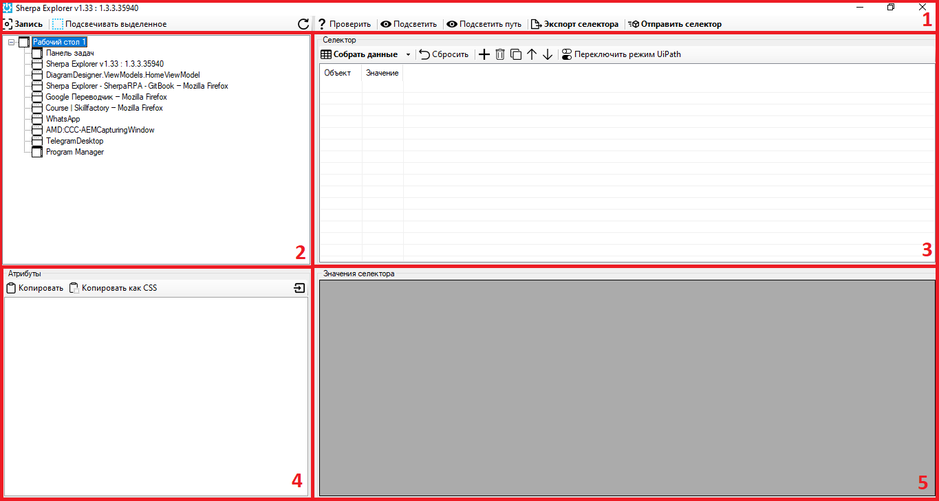
The main menu of Sherpa Explorer allows you to highlight the desired element by pressing the CTRL key, view the full hierarchy of elements up to the current one, check for the presence of an element, and export the element's selector to the Sherpa Designer development environment blocks in the “Selector” property.
| No. | Interface Element | Description |
| 1. | “Record” button | When hovering the mouse cursor over the desired element and pressing the CTRL key, it displays the entire hierarchy of elements in the Sherpa Explorer window. |
| 2. | “Highlight Selected” checkbox | When searching for an element (using the “Record” button), it allows highlighting the element (a pink border appears around the element). |
| 3. | “Check” button | Allows checking for the presence of an element based on the specified selector parameters. |
| 4. | “Highlight” button | Highlights the element based on the specified selector. |
| 5. | “Highlight Path” button | Highlights elements based on the specified selector, starting from the top of the hierarchy down to the current one. |
| 6. | “Export Selector” button | Copies the selector value to the clipboard for further pasting into the corresponding block. |
| 7. | “Send Selector” button | Transfers the parameters selected in Sherpa Explorer to the currently active block for working with selectors, provided its properties are open. |
Element Tree#
.png)
Element Tree displays a tree structure path to a specific application element. By double-clicking on an element in the tree, the corresponding path opens, allowing access to that element. Thus, you can drill down until the end element of the path is found.
Selector#
.png)
| No. | Interface Element | Description |
| 1. | “Gather Data” button | Allows gathering data from the element. Also, you can use the F5 key to perform the action. |
| 2. | “Reset” button | Allows resetting the default selector data. |
| 3. | button  | Allows adding a row. |
| 4. | button  | Allows deleting a row. |
| 5. | button  | Allows cloning a row. |
| 6. | button .png) | Allows moving a row up. |
| 7. | button .png) | Allows moving a row down. |
| 8. | “Switch UiPath” button | Allows switching the UiPath mode. |
| 9. | “Object” column | Displays the type of the element. |
| 10. | “Value” column | Displays the attributes of the element. |
Attributes#
.png)
| No. | Interface Element | Description |
| 1. | “Copy” button | Allows copying the value to the clipboard. |
| 2. | “Copy as CSS” button | Allows copying as part of the CSS selector to the clipboard. |
| 3. | button .png) | Allows importing the value into the selector. |
| 4. | “BoundingRectangle” row | Indicates the rectangular area that fully encompasses the element. |
| 5. | “ClassName” row | The name of the element's class. |
| 6. | “ControlType” row | The type of control element (e.g., button, text box, etc.). |
| 7. | “FrameworkId” row | The identifier of the framework used (e.g., Win32, WPF, etc.). |
| 8. | “HasKeyboardFocus” row | If this row contains the value 1, it indicates that the mode is active where the User can type text or use keys to control the element. If this row contains the value 0, then this element in the interface currently does not receive keyboard focus. |
| 9. | “Id” row | The identifier of the element (usually unique for each element). |
| 10. | “Index” row | The index of the element in the list of matching elements. |
| 11. | “IsContentElement” row | Indicates whether the element is part of the container's content. |
| 12. | “IsControlElement” row | Indicates whether the element in the interface is a control or interactive element. |
| 13. | “IsDataValidForForm” row | Indicates whether the data obtained from the element is valid for use in the current form. |
| 14. | “IsEnabled” row | Indicates whether the element is active for interaction. |
| 15. | “IsKeyboardFocusable” row | Indicates whether the element can receive keyboard focus. |
| 16. | “IsOffscreen” row | Indicates whether the element is off the screen. |
| 17. | “IsPassword” row | Indicates whether the element is a password input field. |
| 18. | “IsRequiredForForm” row | Indicates whether the element is required to fill out the form. |
| 19. | “LocalizedControlType” row | Localized description of the control element type. |
| 20. | “Name” row | The name of the element. |
| 21. | “NativeWindowHandle” row | The window handle associated with the element. |
| 22. | “Orientation” row | The orientation of the element (e.g., horizontal or vertical). |
| 23. | “ProcessId” row | The identifier of the process to which the element belongs. |
| 24. | “ProviderDescription” row | Description of the provider (access interface to elements). |
| 25. | “Role” row | The role of the element (e.g., button, input field, etc.). |
| 26. | “States” row | The states of the element (e.g., selected, expanded, etc.). |
Selector Values#
.png)
An area where specific values selected by the User through the selector are displayed.